Monday, 22 September 2014

H2O, Domino & Kaggle Quick-Start Guide and RUGSMAPS2

Following up on my previous posts about H2O Deep Learning (TTTAR1) and RUGSMAPS (TTTAR2), here is a quick update on two interesting things I have been working on: a Kaggle tutorial and a new RUGSMAPS app.

Short Tutorials based on a Kaggle Competition

First of all, I would like to share with you my first ever guest post on Domino Data Lab's blog - “How to use R, H2O and Domino for a Kaggle competition”.

My guest post on Domino Data Lab's blog.

As a sequel to TTTAR1, this blog post is a more in-depth machine learning article with starter code and short tutorials. The purpose is to get more people started with R, H2O Deep Learning and Domino Data Lab using a recent Kaggle competition as case study. The short tutorials should be generic enough for Kaggle competitions as well as any general data mining exercises. I hope you will find it useful if you are interested in machine learning stuff.

RUGSMAPS2: A Crowd-Sourcing Experiment

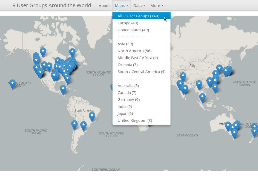
Shortly after RUGSMAPS went public, Ines Garmendia kindly pointed out that there were several mistakes in the app (thanks, Ines! … at the same time, doh!!!). For example, the two groups in Madrid are supposed to be much further apart than I thought. More importantly, they are subgroups of the main “Comunidad R Hispano” group. Without Ines' feedback, I would never be able to notice that myself. I was only relying on the source data from the contest.

I know a lot more local knowledge is required to make RUGSMAPS a much better app for the R community. It is also necessary to streamline the updating process so that new groups can be added easily. Therefore, I am now proposing a crowd-sourcing experiment and am hoping that more RUGs organisers/members can contribute in future. My idea is a dynamic web app (RUGSMAPS2) that reads information directly from a live Google spreadsheet.

Let's start with my favourite LondonR and its sister group ManchesterR. I know a lot about them personally so I can provide information like their key sponsor (Mango Solutions), venues and websites. To make this information available to all other R users, I just need to update the Google spreadsheet and the new RUGSMAPS2 will automatically render maps with new data.

Adding venue, key sponsors, websites and other information.

LondonR and ManchesterR with additional information.

For the Comunidad R Hispano issues I mentioned above, you can see that Ines helped me to fill in some new information about the four subgroups:

Entering main and subgroup information.

Fixing RUGSMAPS to show subgroups of Comunidad R Hispano correctly.

So if you're interested in helping me out or know someone else who might be able to help, please spread the word and forward this Google spreadsheet. Oh, wait ... can EVERYONE edit that spreadsheet??? Yes. I understand there might be issues if everyone can edit the spreadsheet without my permission. That's why I am calling it an experiment! I would like to see whether I can turn this into a successful crowd-sourcing project (or, otherwise, organised chaos). The app won't go live until I am happy with the new information and features. You can check out the RUGSMAPS2 repository for all the latest development!


That's it for now. Take my words for it, give H2O and Domino a try and you won't regret it!

Tuesday, 26 August 2014

TTTAR2: My First Shiny App with Bootstrap - #RUGSMAPS


Thing To Try After useR! part 2 (TTTAR2)


Originally, this post was supposed to be a sequel to TTTAR1 about h2o machine learning. Since TTTAR1 I have been carrying out more h2o tests both locally and on the cloud with the very kind support of Nick Elprin from Domino. The more I find out about h2o and Domino, the more I get addicted. So my original plan was to write a new post about combining the best of h2o and Domino - building a scalable data analytic platform on the cloud with R as the main interface.

Well something happened unexpectedly so here is a change of plan – I am going to talk about Shiny web application and data visualisation again. I will get back to h2o machine learning and Domino later. In the meantime, check out Nick’s recent blog post about Domino which is directly relevant to what I am planning to blog next.


Beautiful Shiny Apps at useR!


I know how to use Shiny and Bootstrap. Yet, before useR!, I had never felt the need to combine them. Shiny already has a clean and tidy layout by default – so why bother changing it? But then I changed my mind completely after useR!. There were quite a few beautiful Shiny apps with custom CSS on display. For example, during the second poster session, I saw this amazing Shiny app created by Christian Gonzalez and Robert Youmans.


When I had the chance to play with the app on Christian’s laptop, that sleek and professional interface just completely blew my mind. It was at this moment I realised that I was wrong and it’s time to up my game.


Revolution Analytics Data Visualisation Contest


Just like how I learned about maps in R last year, I needed to find something interesting and dive into it. After useR!, I read about this contest from Joseph’s post. It seemed like a good data visualisation exercise with a small and tabulated dataset. It was also a good opportunity to combine Shiny and rMaps (something that I hadn’t managed to do when I last worked on rCrimemap many months ago).


The Making of R User Groups Maps (RUGSMAPS)


Many thanks to the detailed Shiny examples from RStudio and Chris Beeley’s book as well as the huge rCharts/rMaps contributions by Ramnath Vaidyanathan and Kenton Russell on GitHub and Stackoverflow, I didn't need to spend much time on coding as many useful code snippets are just one Google search away.

I did, however, spend a lot more time on the layout design and user interface. Font size, colours, white spaces, choice of base map etc you name it. I also tried quite a few Bootstrap themes and finally settled with Spacelab. I am not the best person to describe the final design with correct art terminology. I just feel that this combination of blue, grey and white gives a clean layout (yet not too flashy). The RUGSMAPS app is currently hosted on ShinyApps (once again, thanks RStudio!!!)

Don't agree with my colour choices? No worries, fork the repository and modify the boostrap.css in the www folder. More information can be found on the "About" page of the app so I am not going to repeat it here. Please try it out and tell me what you think about it.


What's Next?


As the RUGSMAPS app is my final submission to the contest, I am going to lock down the version so the app becomes a reference point version 1. Further improvements will be made independently (let’s just call it RUGSMAPS v2 for now). The idea is to collect more local information from the RUGs and display it accordingly on the maps. For example, in additional to the group name and city location, I can include more information such as usual meetup location, key sponsors, website, photos etc.

I have seen a cool example from Alex Bresler that shows images in the markers’ pop-up window. I am certain that we can display more information than just the group name and city location. BTW, Alex and his colleagues at Aragorn Technologies are doing some very cool interactive sports data visualisation with R for huge events (e.g. NBA, US Open) – do check them out!!!


Together We Can Make It Better! 


If you have some local information about the RUGs and are interested in improving the RUGSMAPS for the community, please drop me an email (jofai.chow@gmail.com), comment on this post or create issues on the repository. We can make this a central info hub of all RUGs! Let’s do it!!!


Acknowledgement 


First of all, I would like to thank Revolution Analytics (David and Joseph) for the award! I would also like to emphasise that the RUGSMAPS app did not just come out of my head from nowhere. It is the direct result of many cool ideas I learned and borrowed from the R community over the last year or so. To all my R friends I met on Twitter / GitHub / useR!, if you're reading this, you know I am talking about you. So thank you very much everyone!


The Rise of R in Hydroinformatics


(View from the Empire State Building Observatory - it was at this moment I realised that I should begin my career as Batman)

Just a bit off the topic, I attended the Hydroinformatics conference in New York last week and I witnessed the rise of R in this field. Although MATLAB still seems the most common programming language (ever wonder why my twitter handle sounds a bit too odd?), there were more talks about using R for Hydroinformatics this time (compared to none in the same conference two years ago). People were presenting their R packages and discussing how they use R for interfacing as well as teaching. RStudio IDE was on the big screen several times!

Yet, still no sight of Shiny but I think I can change that!!!


Friday, 25 July 2014

Things to try after useR! - Part 1: Deep Learning with H2O


Annual R User Conference 2014

The useR! 2014 conference was a mind-blowing experience. Hundreds of R enthusiasts and the beautiful UCLA campus, I am really glad that I had the chance to attend! The only problem is that, after a few days of non-stop R talks, I was (and still am) completely overwhelmed with the new cool packages and ideas.

Let me start with H2O - one of the three promising projects that John Chambers highlighted during his keynote (the other two were Rcpp/Rcpp11 and RLLVM/RLLVMCompile).

What's H2O?

"The Open Source In-Memory, Prediction Engine for Big Data Science" - that's what Oxdata, the creator of H2O, said. Joseph Rickert's blog post is a very good introduction of H2O so please read that if you want to find out more. I am going straight into the deep learning part.

Deep Learning in R

Deep learning tools in R are still relatively rare at the moment when compared to other popular algorithms like Random Forest and Support Vector Machines. A nice article about deep learning can be found here. Before the discovery of H2O, my deep learning coding experience was mostly in Matlab with the DeepLearnToolbox. Recently, I have started using 'deepnet', 'darch' as well as my own code for deep learning in R. I have even started developing a new package called 'deepr' to further streamline the procedures. Now I have discovered the package 'h2o', I may well shift the design focus of 'deepr' to further integration with H2O instead!

But first, let's play with the 'h2o' package and get familiar with it.

The H2O Experiment

The main purpose of this experiment is to get myself familiar with the 'h2o' package. There are quite a few machine learning algorithms that come with H2O (such as Random Forest and GBM). But I am only interested in the Deep Learning part and the H2O cluster configuration right now. So the following experiment was set up to investigate:
  1. How to set up and connect to a local H2O cluster from R.
  2. How to train a deep neural networks model.
  3. How to use the model for predictions.
  4. Out-of-bag performance of non-regularized and regularized models.
  5. How does the memory usage vary over time.

Experiment 1: 

For the first experiment, I used the Wisconsin Breast Cancer Database. It is a very small dataset (699 samples of 10 features and 1 label) so that I could carry out multiple runs to see the variation in prediction performance. The main purpose is to investigate the impact of model regularization by tuning the 'Dropout' parameter in the h2o.deeplearning(...) function (or basically the objectives 1 to 4 mentioned above).

Experiment 2: 

The next thing to investigate is the memory usage (objective 5). For this purpose, I chose a bigger (but still small in today's standards) dataset MNIST Handwritten Digits Database (LeCun et al.). I would like to find out if the memory usage can be capped at a defined allowance over long period of model training process.

Findings

OK, enough for the background and experiment setup. Instead of writing this blog post like a boring lab report, let's go through what I have found out so far. (If you want to find out more, all code is available here so you can modify it and try it out on your clusters.)

Setting Up and Connecting to a H2O Cluster

Smoooooth! - if I have to explain it in one word. Oxdata made this really easy for R users. Below is the code to start a local cluster with 1GB or 2GB memory allowance. However, if you want to start the local cluster from terminal (which is also useful if you see the messages during model training), you can do this java -Xmx1g -jar h2o.jar (see the original H2O documentation here).

By default, H2O starts a cluster using all available threads (8 in my case). The h2o.init(...) function has no argument for limiting the number of threads yet (well, sometimes you do want to leave one thread idle for other important tasks like Facebook). But it is not really a problem.

Loading Data

In order to train models with the H2O engine, I need to link the datasets to the H2O cluster first. There are many ways to do it. In this case, I linked a data frame (Breast Cancer) and imported CSVs (MNIST) using the following code.


Training a Deep Neural Network Model

The syntax is very similar to other machine learning algorithms in R. The key differences are the inputs for x and y which you need to use the column numbers as identifiers.


Using the Model for Prediction

Again, the code should look very familiar to R users.


The h2o.predict(...) function will return the predicted label with the probabilities of all possible outcomes (or numeric outputs for regression problems) - very useful if you want to train more models and build an ensemble.

Out-of-Bag Performance (Breast Cancer Dataset)


No surprise here. As I expected, the non-regularized model overfitted the training set and performed poorly on test set. Also as expected, the regularized models did give consistent out-of-bag performance. Of course, more tests on different datasets are needed. But this is definitely a good start for using deep learning techniques in R!

Memory Usage (MNIST Dataset)


This is awesome and really encouraging! In near idle mode, my laptop uses about 1GB of memory (Ubuntu 14.04). During the MNIST model training, H2O successfully kept the memory usage below the capped 2GB allowance over time with all 8 threads working like a steam train! OK, this is based on just one simple test but I already feel comfortable and confident to move on and use H2O for much bigger datasets.

Conclusions

OK, let's start from the only negative point. The machine learning algorithms are limited to the ones that come with H2O. I cannot leverage the power of other available algorithms in R yet (correct me if I am wrong. I will be very happy to be proven wrong this time. Please leave a comment on this blog so everyone can see it). Therefore, in terms of model choices, it is not as handy as caret and subsemble.

Having said that, the included algorithms (Deep Neural Networks, Random Forest, GBM, K-Means, PCA etc) are solid for most of the common data mining tasks. Discovering and experimenting with the deep learning functions in H2O really made me happy. With the superb memory management and the full integration with multi-node big data platforms, I am sure this H2O engine will become more and more popular among data scientists. I am already thinking about the  Parallella project but I will leave it until I finish my thesis.

I can now understand why John Chambers recommended H2O. It has already become one of my essential R tools for data mining. The deep learning algorithm in H2O is very interesting, I will continue to explore and experiment with the rest of the regularization parameters such as 'L1', 'L2' and 'Maxout'.

Code

As usual, code is available at my GitHub repo for this blog.

Personal Highlight of useR! 2014

Just a bit more on useR! During the conference week, I met so many cool R people for the very first time. You can see some of the photos by searching #user2014 and my twitter handle together. Other blog posts about the conference can be found here, herehere, herehere and here. For me, the highlight has to be this text analysis by Ajay:
... which means I successfully made Matlab trending with R!!! 

During the conference banquet, Jeremy Achin (from DataRobot) suggested that I might as well change my profile photo to a Python logo just to make it even more confusing! It was also very nice to speak to Matt Dowle in person and to learn about his amazing data.table journey from S to R. I have started updating some of my old code to use data.table for the heavy data wrangling tasks.

By the way, Jeremy and the DataRobot team (a dream team of top Kaggle data scientists including Xavier who gave a talk about "10 packages to Win Kaggle Competitions") showed me an amazing demo of their product. Do ask them for a beta account and see for yourself!!!

There are more cool things that I am trying at the moment. I will try to blog about them in the near future. If I have to name a few right now ... that will be:

(Pheeew! So here is my first blog post related to machine learning - the very purpose of starting this blog. Not bad it finally happened after a whole year!)

Friday, 6 June 2014

rCharts Parcoords x Simpsons x Blocks


Interactive Parallel Coordinates with Multiple Colours

For my research project, I need a tool to visualise results from multi-objective optimisations. Below is one of my early attempts using base R and parcoord in the MASS package, I have no problem using them for publication. However, these charts are all static. For a practical decision support tool (something I am working on), I need the charts to be interactive so that users can adjust the range/thresholds in each parameter and narrow down the things to display in real time.


Many thanks to Ken (timelyportfolio) who kindly pointed me to his code examples. Based on that, I developed a prototype version of the interactive parallel coordinates plot with multiple colours (as shown above). OK, the values in the chart are totally unrelated to my research - I just used the 'Theoph' dataset in R for testing purposes. Yet, this is a much needed exercise to see if I can use rCharts parallel coordinates for my research. The answer, of course, is YES. It also works with my customised colour palette too (using Bart Simpson this time)!


Here is the R code for the above chart:


Showing your rCharts on bl.ocks.org

In the process of making this plot, I also discovered how to display rCharts (d3, html or practically any code) on Mike Bostock's site "bl.ocks.org". If you haven't seen his site, do check this out. It is one of the coolest things on earth.


I wanted to have a gallery like that too ... but I didn't know how. I used to think that Ramnath and Ken must have bought Mike a beer so that they can have their stuff hosted on bl.ocks.org (see bl.ocks.org/ramnathv and bl.ocks.org/timelyportfolio). I was very wrong, everyone with a GitHub account can do it. All you need are your imagination (and some gists). The site automatically pulls your gists and displays them as beautiful blocks gallery.

In order to display your cool rCharts on bl.ocks.org, you can either:
  1. publish the rCharts to gist using the '$publish' function (e.g. r1$publish('name.of.gist', host = 'gist')  where r1 is the rCharts object)
  2. save the rCharts as a stand-alone HTML (e.g. r1$save('index.html', cdn = TRUE)) and then include it in a gist.
For optimal display, I would recommend setting your rCharts size to 960 x 500 (same as the display size on bl.ocks.org). You can also include a 'README.md' file and a 'thumbnail.png' to provide more information. I think the best resolution for the thumbnail is 230 x 120 (about the same aspect ratio as full display). You will need to manually push the png file (see this post for more details).

So here are the parallel coodinates plot as shown on bl.ocks.org ...


... and my gallery at bl.ocks.org/woobe


Latest on Colour Palette Generator

First, let me point you to Russell Dinnage's blog post. It is easily one of the finest R blog posts I've read so far. All these colours and graphs. Wow! It's yet another #RCanDoThat moment for me (so good it needs a hashtag).


So many thanks to his effort and cool ideas, we continue to add more functions to the rPlotter package. It is also a great opportunity for us to better understand the pull/merge GitHub mechanism.

Credits

Again, I would like to thank Ken for his help (not only this time but many times before this on visualisation stuff) as well as Ramnath, Mike and Russell.


Tuesday, 27 May 2014

Towards (Yet) Another R Colour Palette Generator. Step One: Quentin Tarantino.


Why?

I love colours, I love using colours even more. Unfortunately, I have to admit that I don't understand colours well enough to use them properly. It is the same frustration that I had about one year ago when I first realised that I couldn't plot anything better than the defaults in Excel and Matlab! It was for that very reason, I decided to find a solution and eventually learned R. Still learning it today.

What's wrong with my previous attempts to use colours? Let's look at CrimeMap. The colour choices, when I first created the heatmaps, were entirely based on personal experience. In order to represent danger, I always think of yellow (warning) and red (something just got real). This combination eventually became the default settings.


"Does it mean the same thing when others look at it?"

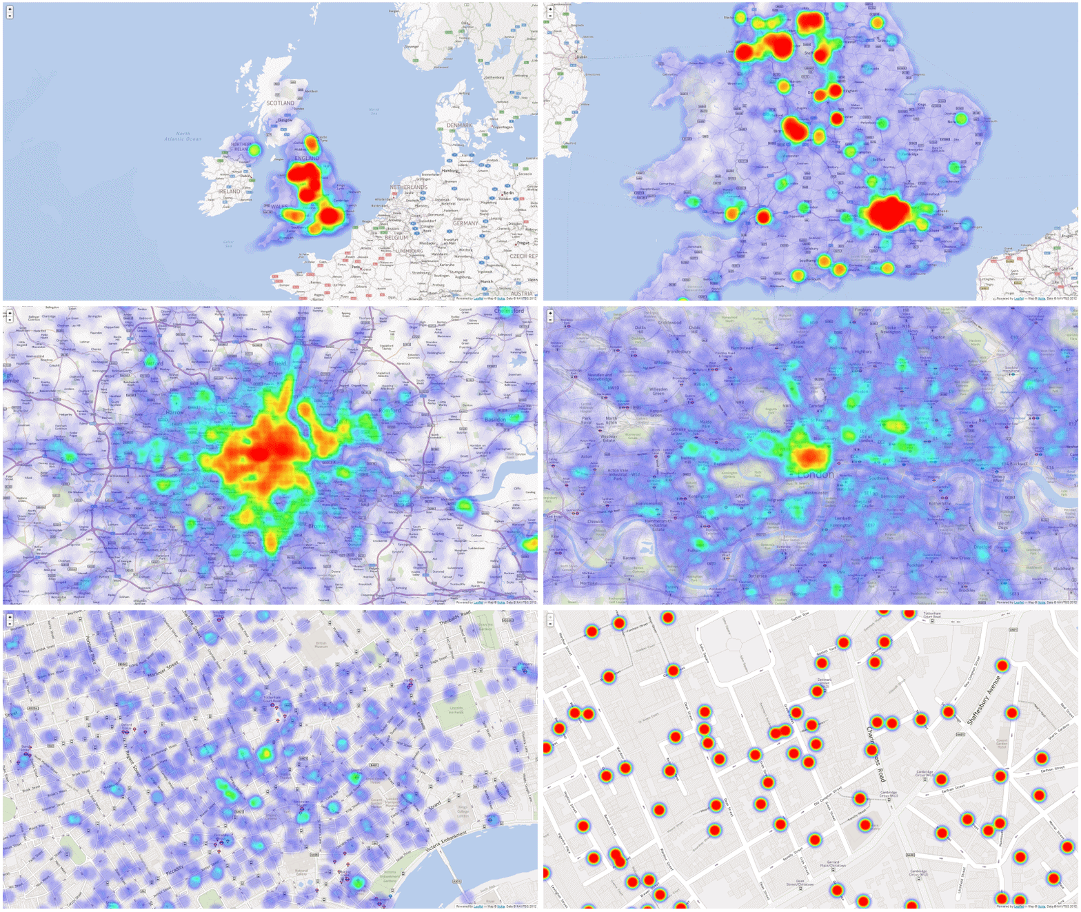
This question has been bugging me since then. As a temporary solution for CrimeMap, I included controls for users to define their own colour scheme. Below are some examples of crime heatmaps that you can create with CrimeMap.


Personally, I really like this feature. I even marketed this as "highly flexible and customisable - colour it the way you like it!" ... I remember saying something like that during LondonR (and I will probably repeat this during useR later).

Then again, the more colours I can use, the more doubts I have with the default Yellow-Red colour scheme. What do others see in those colours? I need to improve on this! In reality, you have one chance, maybe just a few seconds, to tell your very important key messages and to get attention. You can't ask others to tweak the colours of your data visualisation until they get what it means.

Therefore, I know another learning-by-doing journey is required to better understand the use of colours. Only this time, I already have about a year of experience with R under my belt, I decided to capture all the references, thinking and code in one R package.

Existing Tools

Given my poor background in colours, a bit of research on what's available is needed. So far I have found the following. Please suggest other options if you think I should be made aware of (thanks!). I am sure this list will grow as I continue to explore more options.

Online Palette Generator with API

Key R Packages

  • RColorBrewer by Erich Neuwirth - been using this since very first days
  • colorRamps by Tim Keitt - another package that I have been using for a long time
  • colorspace by Ross Ihaka et al. - important package for HCL colours
  • colortools by Gaston Sanchez - for HSV colours
  • munsell by Charlotte Wickham - very useful for exploring and using Munsell colour systems

Funky R Packages and Posts:

Other Languages:


The Plan

"In order to learning something new, find an interesting problem and dive into it!" - This is roughly what Sebastian Thrun said during "Introduction to A.I.", the very first MOOC I participated. It has a really deep impact on me and it has been my motto since then. Fun is key. This project is no exception but I do intend to achieve a bit more this time. Algorithmically, the goal of this mini project can be represented as code below:

> is.fun("my.colours") & is.informative("my.colours")
> TRUE

Seriously speaking, based on the tools and packages mentioned above, I would like to develop a new R package that does the following five tasks. Effectively, these should translate into five key functions (plus a sixth one as a wrapper that goes through all steps in one go).
  1. Extracting colours from images (local or online).
  2. Selecting and (adjusting if needed) colours with web design and colour blindness in mind.
  3. Arranging colours based on colour theory.
  4. Evaluating the aesthetic of a palette systematically (quantifying beauty).
  5. Sharing the palette with friends easily (think the publish( ) and load_gist( ) functions in Shiny, rCharts etc).
I decided to start experimenting with colourful movie posters, especially those from Quentin Tarantino. I love his movies but I also understand that those movies might be offensive to some. That is not my intention here as I just want to bring out the colours. If these examples somehow offend you, please accept my apologies in advance.

First function - rPlotter :: extract_colours( )

The first step is to extract colours from an image. This function is based on dsparks' k-means palettle gist. I modified it slightly to include the excellent EBImage package for easy image processing. For now, I am including this function with my rPlotter package (a package with functions that make plotting in R easier - still in early development).

Note that this is the very first step of the whole process. This function ONLY extracts colours and then returns the colours in simple alphabetical order (of the hex code). The following examples further illustrate why a simple extraction alone is not good enough.

Example One - R Logo

Let's start with the classic R logo.


So three-colour palette looks OK. The colours are less distinctive when we have five colours. For the seven-colour palette, I cannot tell the difference between colours (3) and (5). This example shows that additional processing is needed to rearrange and adjust the colours, especially when you're trying to create a many-colour palette for proper web design and publication.


Example Two - Kill Bill

What does Quentin_Tarantino see in Yellow and Red?


Actually the results are not too bad (at least I can tell the differences).


Example Three - Palette Tarantino

OK, how about a palette set based on some of his movies?


I know more work is needed but for now I am quite happy playing with this.


Example Four - Palette Simpsons

Don't ask why, ask why not ...


I am loving it!


Going Forward

So the above examples show my initial experiments with colours. It will be, to me, a very interesting and useful project in long-term. I look forward to making some sports related data viz when the package reaches a stable version.

The next function in development will be "select_colours()". This will be based on further study on colour theory and other factors like colour blindness. I hope to develop a function that automatically picks the best possible combination of original colours (or adjusts them slightly only if necessary). Once developed, a blog post will follow. Please feel free to fork rPlotter and suggest new functions.

useR! 2014

If you're going to useR! this year, please do come and say hi during the poster session. I will be presenting a poster on the crime maps projects. We can have a chat on CrimeMap, rCrimemap, this colour palette project or any interesting open-source projects.

Acknowledgement

I would like to thank Karthik Ram for developing and sharing the wesanderson package in the first place. I asked him if I could add some more colours to it and he came back with some suggestions. The conversation was followed by some more interesting tweets from Russell Dinnage and Noam Ross. Thank you all!

I would also like to thank Roland Kuhn for showing how to embed individual files of a gist. This is the first time I embed code here properly.

Tweets are the easiest way for me to discuss R these days. Any feedback or suggestion,

Friday, 21 March 2014

Updates on Interactive rCrimemap, rBlocks ... and the Packt offer!


Testing rCrimemap as a Self-Contained Web Page

I've been learning more about rMaps and rCharts since the LondonR meeting. There are many amazing things you can do with rCharts but it does take time to learn all the tweaks. For example, I just discovered that the rMaps objects (like other rCharts ojects) can be saved as a self-contained webpage.

So here are the links to one of the maps I rendered with rCrimemap - visualising all the England, Wales and N. Ireland crimes in Jan 2014 (not sure why some of the crimes were recorded in Scotland - I'll need to further investigate this later). Eventually, I hope to build a new Shiny web app for rCrimemap that allows users to change the settings like the original CrimeMap.


Note: I would recommend NOT to try this on smartphones. I will need to figure out how the map can be trimmed and optimised for smartphones later.

Yet Another rBlocks Experiment

Playing with the EBImage package this time, I wrote this script to pixelate a picture and re-colour it with rBlocks (just for fun - not practical at all ...) (Gist - rBlocks_test_04_pixelation.R)


Celebrating Packt's 2000th Book

Finally, Packt is offering "Buy One Get One Free" on all ebooks to celebrate the 2000th title!!!


Wednesday, 19 March 2014

The #rBlocks Experiments


What's this ?

Conway's Game of Life Animated using #rstats #rBlocks #a... on Twitpic

Where should I start? OK, the story goes like this ...


What's next? Let's go crazy with colours ... (to be continued)

Wednesday, 12 March 2014

Slidify my R journey from @matlabulous to rCrimemap


My LondonR Talk

Thanks to Mango Solutions (LondonR organiser), I was given the opportunity last night to talk about my mini project ‘CrimeMap’Instead of going through all the technical details behind the scenes, I chose to talk the audience through my R journey from a noob to a heavy user. CrimeMap was used as a case study to show how ones can benefit from learning R (or, in some ways, trying to justify the time I spent staring at RStudio IDE last year). The feedback was really great and the talk effectively expanded my network in the data science community so I am really grateful for that! You can find my presentation here.

Before the main event, there was an excellent R-Python workshop by Chris Musselle. The other two interesting presentations were "Dynamic Report Generation" by Kate Hanley and "Customer Clustering for Retail Marketing" by Jon Sedar. Their presentations will soon be made available here.

CrimeMap - A Wonderful Learning Experience

When I first started learning R for real, the goal was very simple - "let's plot something pretty with ggplot2". Well, a lot has changed since then. The more I learned, the more I discovered. It is really hard to summarise the 'R' awesomeness in a few slides due to its diversity. One thing I am absolutely certain is that I made the right move about a year ago to shift from MATLAB to R. Yet, I am keeping my twitter account name @matlabulous just to remind myself that ones should always keep an open mind for new and evolving technology (... and should avoid getting a tattoo of your potential ex-gf/bf's name. On that note, no, I don't have a tattoo.For more information about the CrimeMap, please see my previous posts here, here and here.

Using Slidify for Professional Presentation

The talk was also the first time I presented something totally unrelated to water engineering. I thought, for a change, let’s try something different. Then I remembered looking at the Slidify slides from Jeff Leek’s Data Analysis course back in Jan-March last year. I thought that would fit perfectly for LondonR because the whole presentation would be coded completely in R. It would be a good reason to learn Slidify too. So I went through the Slidify examples, put some slides together, tweaked the CSS a little bit and then published it to GitHub – a streamline Slidify workflow well thought and designed by Ramnath Vaidyanathan. To me, the results are amazing! So amazing that I am confident to leave PowerPoint and use Slidify for professional presentations in the future.


rMaps + CrimeMap = rCrimemap

Two weeks before the presentation, I wrote an email to Ramnath as I wanted to thank him for Slidify. I told him how I enjoyed using Slidify for the LondonR slides. Out of the blue, Ramnath told me that he had seen my CrimeMap already and he kindly pointed me to this blog post about using Leaflet heat map in rMaps. I thought, OMG, why now? Then I thought, yeah, why not? So I created a new package called ‘rCrimemap’ based on Ramnath’s example and the codes from the CrimeMap project – just in time for the LondonR meeting. At first, I wanted to called the package something different but eventually I chose rCrimemap so it aligns well with Ramnath’s rCharts and rMaps.

Using ‘rCrimemap’

rCrimemap is still raw and experimental. It depends on some new packages such as dplyr, dev version of rCharts and rMaps etc. I have only developed and tested it recently on Linux. Please give it a try if you have a chance. All feedback and suggestions are welcome. Codes are here.

To install it, you will need the RStudio IDE version 0.98.501 or newer and the following packages ...

require(devtools)
install.packages(c("base64enc", "ggmap", "rjson", "dplyr"))
install_github('ramnathv/rCharts@dev')
install_github('ramnathv/rMaps')

After that, install rCrimemap package via ... 


install_github('woobe/rCrimemap')

rCrimemap is basically a big wrapper function. In fact, there is only one function 'rcmap( )' in the package at the moment. (OK, it is obviously an overkill ... but I really wanted to try developing a package.) The function is very similar to the first one I did for CrimeMap prior to the Shiny development. In terms of graphical functionality, it is not as flexible as the CrimeMap yet (for example, CrimeMap can do all these colours and facet). However, it is much more powerful than CrimeMap in the sense that users can move around, zoom in and out like using a real digital map. The colour of the heat map also changes when you zoom in/out. This gives users a much better visibility of where the local crime hot spots are when they zoom in. OK, enough said, let’s go through some example usage …

The arguments of the function 'rcmap( )' are:
  1. location: point of interest within England, Wales and Northern Ireland
  2. period: a month between Dec 2010 and Jan 2014 (in the format of yyyy-mm)
  3. type: category of crime (e.g. "All", "Anti-social behaviour")
  4. map_size: the resolution of the map in pixel (e.g. Full HD = c(1920, 1080))
  5. provider: the base map provider (e.g. "Nokia.normalDay", "MapQuestOpen.OSM")
  6. zoom: zoom level of the map (e.g. I recommend starting with 10 to show all the crimes)

Example 1: “Ball Brothers EC3R 7PP” (LondonR venue since March 2013) during the London riot (Aug 2011). The map can be viewed within RStudio IDE or be exported to a browser. The animation was created outside R (Oh ... what if rCrimemap + animation package? ... I will leave that for later.)

rcmap("Ball Brothers EC3R 7PP", "2011-08", "All", c(1000,1000),"Nokia.normalDay")


Example 2: Manchester in Jan 2014 - using "MapQuestOpen.OSM" as base map instead.

rcmap("Manchester", "2014-01", "All", c(1000,1000), "MapQuestOpen.OSM")


Credits


There you go, enjoy :)

Wednesday, 22 January 2014

CrimeMap, LondonR and a Book Review


In preparation for my LondonR talk in March, I am polishing up my CrimeMap (see previous blog post here and here) in my spare time.

Thanks to Chris Beeley and Packt, I won a free e-copy of Chris Beeley’s book following his great talk about Shiny web app during the last LondonR meeting. I find this book really useful as I am trying to implement new functionality and ideas into my CrimeMap. It illustrates very well what you can do with Shiny using lots of practical examples. So here is a quick book review for those who are also interested in developing Shiny web apps.

The book begins with a short but essential introduction to some key R functions for handling data and graphics. Chapter 2 is a walk-through of key Shiny components nicely demonstrated by an example of Google Analytics API integration. It then discusses how Shiny can be further extended with the use of HTML, CSS, JavaScript and jQuery. I find chapter 4 most useful as it goes deep into the practical aspects of handling reactivity and taking full control of inputs and outputs. The book ends with some tips on code sharing and browser compatibility.

I hope you will find this short review useful. Reviews from others can be found here, here and here

BTW, LondonR is great (thank you very much Mango Solutions for sponsoring it since 2009)!!! You can find the presentations from previous meetings here.