Friday, 21 March 2014

Updates on Interactive rCrimemap, rBlocks ... and the Packt offer!


Testing rCrimemap as a Self-Contained Web Page

I've been learning more about rMaps and rCharts since the LondonR meeting. There are many amazing things you can do with rCharts but it does take time to learn all the tweaks. For example, I just discovered that the rMaps objects (like other rCharts ojects) can be saved as a self-contained webpage.

So here are the links to one of the maps I rendered with rCrimemap - visualising all the England, Wales and N. Ireland crimes in Jan 2014 (not sure why some of the crimes were recorded in Scotland - I'll need to further investigate this later). Eventually, I hope to build a new Shiny web app for rCrimemap that allows users to change the settings like the original CrimeMap.
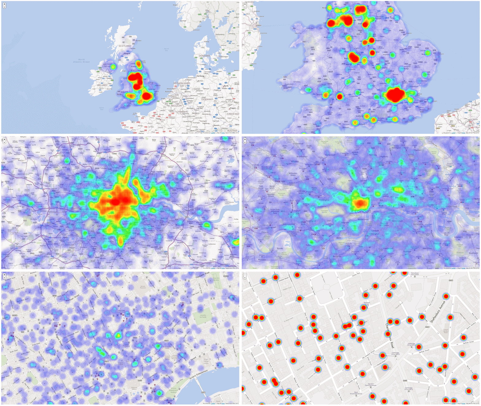


Note: I would recommend NOT to try this on smartphones. I will need to figure out how the map can be trimmed and optimised for smartphones later.

Yet Another rBlocks Experiment

Playing with the EBImage package this time, I wrote this script to pixelate a picture and re-colour it with rBlocks (just for fun - not practical at all ...) (Gist - rBlocks_test_04_pixelation.R)


Celebrating Packt's 2000th Book

Finally, Packt is offering "Buy One Get One Free" on all ebooks to celebrate the 2000th title!!!


Wednesday, 19 March 2014

The #rBlocks Experiments


What's this ?

Conway's Game of Life Animated using #rstats #rBlocks #a... on Twitpic

Where should I start? OK, the story goes like this ...


What's next? Let's go crazy with colours ... (to be continued)

Wednesday, 12 March 2014

Slidify my R journey from @matlabulous to rCrimemap


My LondonR Talk

Thanks to Mango Solutions (LondonR organiser), I was given the opportunity last night to talk about my mini project ‘CrimeMap’Instead of going through all the technical details behind the scenes, I chose to talk the audience through my R journey from a noob to a heavy user. CrimeMap was used as a case study to show how ones can benefit from learning R (or, in some ways, trying to justify the time I spent staring at RStudio IDE last year). The feedback was really great and the talk effectively expanded my network in the data science community so I am really grateful for that! You can find my presentation here.

Before the main event, there was an excellent R-Python workshop by Chris Musselle. The other two interesting presentations were "Dynamic Report Generation" by Kate Hanley and "Customer Clustering for Retail Marketing" by Jon Sedar. Their presentations will soon be made available here.

CrimeMap - A Wonderful Learning Experience

When I first started learning R for real, the goal was very simple - "let's plot something pretty with ggplot2". Well, a lot has changed since then. The more I learned, the more I discovered. It is really hard to summarise the 'R' awesomeness in a few slides due to its diversity. One thing I am absolutely certain is that I made the right move about a year ago to shift from MATLAB to R. Yet, I am keeping my twitter account name @matlabulous just to remind myself that ones should always keep an open mind for new and evolving technology (... and should avoid getting a tattoo of your potential ex-gf/bf's name. On that note, no, I don't have a tattoo.For more information about the CrimeMap, please see my previous posts here, here and here.

Using Slidify for Professional Presentation

The talk was also the first time I presented something totally unrelated to water engineering. I thought, for a change, let’s try something different. Then I remembered looking at the Slidify slides from Jeff Leek’s Data Analysis course back in Jan-March last year. I thought that would fit perfectly for LondonR because the whole presentation would be coded completely in R. It would be a good reason to learn Slidify too. So I went through the Slidify examples, put some slides together, tweaked the CSS a little bit and then published it to GitHub – a streamline Slidify workflow well thought and designed by Ramnath Vaidyanathan. To me, the results are amazing! So amazing that I am confident to leave PowerPoint and use Slidify for professional presentations in the future.


rMaps + CrimeMap = rCrimemap

Two weeks before the presentation, I wrote an email to Ramnath as I wanted to thank him for Slidify. I told him how I enjoyed using Slidify for the LondonR slides. Out of the blue, Ramnath told me that he had seen my CrimeMap already and he kindly pointed me to this blog post about using Leaflet heat map in rMaps. I thought, OMG, why now? Then I thought, yeah, why not? So I created a new package called ‘rCrimemap’ based on Ramnath’s example and the codes from the CrimeMap project – just in time for the LondonR meeting. At first, I wanted to called the package something different but eventually I chose rCrimemap so it aligns well with Ramnath’s rCharts and rMaps.

Using ‘rCrimemap’

rCrimemap is still raw and experimental. It depends on some new packages such as dplyr, dev version of rCharts and rMaps etc. I have only developed and tested it recently on Linux. Please give it a try if you have a chance. All feedback and suggestions are welcome. Codes are here.

To install it, you will need the RStudio IDE version 0.98.501 or newer and the following packages ...

require(devtools)
install.packages(c("base64enc", "ggmap", "rjson", "dplyr"))
install_github('ramnathv/rCharts@dev')
install_github('ramnathv/rMaps')

After that, install rCrimemap package via ... 


install_github('woobe/rCrimemap')

rCrimemap is basically a big wrapper function. In fact, there is only one function 'rcmap( )' in the package at the moment. (OK, it is obviously an overkill ... but I really wanted to try developing a package.) The function is very similar to the first one I did for CrimeMap prior to the Shiny development. In terms of graphical functionality, it is not as flexible as the CrimeMap yet (for example, CrimeMap can do all these colours and facet). However, it is much more powerful than CrimeMap in the sense that users can move around, zoom in and out like using a real digital map. The colour of the heat map also changes when you zoom in/out. This gives users a much better visibility of where the local crime hot spots are when they zoom in. OK, enough said, let’s go through some example usage …

The arguments of the function 'rcmap( )' are:
  1. location: point of interest within England, Wales and Northern Ireland
  2. period: a month between Dec 2010 and Jan 2014 (in the format of yyyy-mm)
  3. type: category of crime (e.g. "All", "Anti-social behaviour")
  4. map_size: the resolution of the map in pixel (e.g. Full HD = c(1920, 1080))
  5. provider: the base map provider (e.g. "Nokia.normalDay", "MapQuestOpen.OSM")
  6. zoom: zoom level of the map (e.g. I recommend starting with 10 to show all the crimes)

Example 1: “Ball Brothers EC3R 7PP” (LondonR venue since March 2013) during the London riot (Aug 2011). The map can be viewed within RStudio IDE or be exported to a browser. The animation was created outside R (Oh ... what if rCrimemap + animation package? ... I will leave that for later.)

rcmap("Ball Brothers EC3R 7PP", "2011-08", "All", c(1000,1000),"Nokia.normalDay")


Example 2: Manchester in Jan 2014 - using "MapQuestOpen.OSM" as base map instead.

rcmap("Manchester", "2014-01", "All", c(1000,1000), "MapQuestOpen.OSM")


Credits


There you go, enjoy :)

Wednesday, 22 January 2014

CrimeMap, LondonR and a Book Review


In preparation for my LondonR talk in March, I am polishing up my CrimeMap (see previous blog post here and here) in my spare time.

Thanks to Chris Beeley and Packt, I won a free e-copy of Chris Beeley’s book following his great talk about Shiny web app during the last LondonR meeting. I find this book really useful as I am trying to implement new functionality and ideas into my CrimeMap. It illustrates very well what you can do with Shiny using lots of practical examples. So here is a quick book review for those who are also interested in developing Shiny web apps.

The book begins with a short but essential introduction to some key R functions for handling data and graphics. Chapter 2 is a walk-through of key Shiny components nicely demonstrated by an example of Google Analytics API integration. It then discusses how Shiny can be further extended with the use of HTML, CSS, JavaScript and jQuery. I find chapter 4 most useful as it goes deep into the practical aspects of handling reactivity and taking full control of inputs and outputs. The book ends with some tips on code sharing and browser compatibility.

I hope you will find this short review useful. Reviews from others can be found here, here and here

BTW, LondonR is great (thank you very much Mango Solutions for sponsoring it since 2009)!!! You can find the presentations from previous meetings here.

Wednesday, 4 December 2013

A Recap of the Last Couple Months (Part 1)

It's been a while. I know. I had hoped to finish this a lot earlier and to make my regular contributions to the Stream's Stream. Oh well ... better late than never :)


STREAM Challenge Week (Morpeth, 7-12 July)

Back in July, (nearly) all research engineers from STREAM spent a couple days in Morpeth together. I am only going to show you some photos here. You can find out more about the event from my fellow STREAM-ers Jack Bloodworth and Sarah Cotterill.


Kielder Water and Forest Park
Walking around Morpeth
Carlisle Park - It's Picnic Time!
The Beautiful Morpeth Stepping Stones
STREAM Conference at Newcastle University
Inter-Cohort Rounders' Championship Tournament
Group Presentations for the Morpeth Flooding Challenge 
Dinner and Awards Presentation
STREAM Group Photo at Longhirst Hall


35th IAHR World Congress (Chengdu, 8-13 September)

For the very first time, I travelled back to my home country for work. After a rather busy 2012, I cut down significantly on travel and conferences this year. This conference was my only international duty (well, excluding the Institute of Water Annual Conference in Edinburgh which I travelled from England to Scotland) this year. The IAHR conference was definitely one of the biggest conferences I had ever been to with over 1400 attendances gathering in the Chengdu Century City International Convention Center.

On the first day of conference, I met with XP Solutions' distributor in China - Ewaters. We discussed some potential case studies based on projects in China and agreed on the dates for the post-conference software workshops in Shanghai.


Opening Ceremony. Looking at the back of Professors Dawei Han and Dragan Savic (my past and current supervisor) - what are the chances?

After the technical sessions in the afternoon, we were all invited to join Prof. Roger Falconer (IAHR President) for the president's reception where he welcomed everyone to the congress. It was a very interesting and entertaining evening with stunning face-changing performance by the local Sichuanese opera.

IAHR President's Reception at Shunxing Teahouse

On the third day, I had chosen to visit the Dujiangyan Irrigation Project for the in-congress technical tour. It is one of the oldest irrigation systems in the world and an excellent example of ancient Chinese science and engineering. The project has successfully prevented flooding in Chengdu ever since its completion about 2200 years ago. Simply astonishing!


In-Congress Technical Tour - Dujianyan Irrigation Project
Congress Dinner

On a more serious note, I suited up and delivered a presentation on the last day of the conference. The presentation was a summary of my progress so far and a prologue to the post-conference software workshops. It generated some interests from the Hong Kong Drainage Services Department's representatives. Afterwards, we discussed the possibilities of applying my work in Hong Kong and they had kindly invited me to attend their conference in Hong Kong next year.


As usual, flooding the crowd with colourful visuals.

After the conference, I had a short window to explore the city. (Making the most of it - right, Sarah?)


Wu Hou Shrine Museum
Jin Li, The Ancient Chinese Machine Gun and the Inevitable Invasion of Starbucks
Chengdu at night - Tianfu Square (a Yin Yang from above!)

Overall, I think the IAHR conference was an invaluable experience for me. It allowed me to connect with the people there and to gain a much better understanding of the situation, challenges and needs in China - which means a lot to me as it is my home country. I would also like to thank STREAM and my supervisor Dragan for giving me the opportunities to attend different conferences in last couple years.

Next Stop: Shanghai

XPDRAINAGE workshops in Shanghai and life after the China trip. Watch this space!


Friday, 29 November 2013

Introducing CrimeMap - A Web App Powered by ShinyApps!

A few months ago I did a mini project using open crime data and R to create crime visualisations. At that time, I was already thinking about a web app using Shiny but I couldn't justify the time to develop the app and then set up a server etc. Not until two weeks ago when I received an invitation to join the alpha testing of ShinyApps.


ShinyApps - A Wonderful Discovery

I went through the ShinyApps' getting started guide. Everything looks pretty straight forward. So I decided to go ahead and moved my codes from the crime visualisation project to a new ShinyApps project. The progress was unexpectedly smooth. Given that I had no web application development experience prior to this mini exercise, I consider this a quick success! All credit goes to the RStudio team for providing these tools and hosting services (especially Tareef Kawaf who kindly answered all my questions). I would summarise the whole process in the following few steps:
  1. Sign up for a ShingApps alpha testing account here (you will need a Google account).
  2. Install packages shiny and shinyapps (click on the links for installation help).
  3. Sign in to my.shinyapps.io, give your ShinyApps account a name ("blenditbayes" in my case) and get your application token/secret.
  4. Go through the tutorials, create the ui.R and server.R scripts for your app.
  5. Test the app locally using runApp().
  6. Once you're happy with the app, apply your token/secret and deploy your app using deployApp().
That's it! I can focus my effort solely on developing the app. The rest has been taken care of and simplified by the deployApp() and other ShinyApps functions.
 

CrimeMap in Action

So here is my first ever web app "CrimeMap" powered by ShinyApps! I will go through the usage briefly in the following sections. I hope you can give it a try and give me some feedback (e.g. what features are missing?) so I can continue to improve it. Your comments will be valuable to the ShinyApps development team too.

Basic Usage

First, enter a location of your choice (e.g. London) within England, Wales and Northern Ireland. Select the first month of crime data collection and then the length of the analysis period. After that, click on the "Update" button. My experience is that the graphs should come up within a minute if the length of analysis is less than or equal to 6 months. Depending on the location and the length of analysis, the process might take longer (say a couple minutes). The outputs (at the time of writing) are displayed in three tabs: Data, Crime Map and Trends. The Data tab shows the original crime data records downloaded from the data.police.uk (I may add a feature like "download as CSV in future). The crime map is a density plot of the crime data. Finally, the trends tab shows bar charts of crime records over time in different crime categories. Right click on the map and you can save the image in its original size (1280 x 1280).


Customise the Maps

Continue to scroll down the menu on the left, you will find more settings for the map. Change the facet settings to create map facets according to crime type, categories and month. You can select different Google map format (roadmap, satellite, hybrid or terrain). There are also options to download the Google map image in high resolution (it takes a bit longer), in black & white and at various zoom levels. When you click the "Update" button to refresh the maps, it may take a while to show the new graphs if you have lots of facets.


Fine-tuning the Density Plots

The Density Plot Settings allow user to modify the "behind the scenes" ggplot2 codes. You can modify the layer transparency (alpha range), the number of bins, the width and the colour of the boundary lines as well as the colours of the gradient. My hope is to develop a user-friendly interface that allows users to quickly create maps with their own favourite themes. Surely, ggplot2 is much more powerful than that and has a lot more settings available. What other settings would you like to see here? Please let me know.


Exploring the Trends

Why am I including the trends visualisation? It just happened that I read this article around the same time I received the ShinyApps invitation. As I had already coded something for crime data visualisation, I thought it would be interesting to look at the data myself. So here is a handy tool for you to explore and to visualise the data with a few clicks. I will leave you with your own conclusions.


Feedback Please

As I mentioned above, I am new to web app development and this is my first ever experiment. Please have a go, create a few maps and let me know what can be done better. Thanks in advance!! All the codes are available here.

Thursday, 15 August 2013

Creating a Quick Report with knitr, xtable, R Markdown, Pandoc (and some OpenBLAS Benchmark Results)

To cut a long story short, I always wanted to write professional-looking documents (technical reports and potentially my thesis) with R codes. No more copy and paste. No more Microsoft Word. At the same time, I don't feel comfortable with LaTeX. Somehow I found a workaround with knitr, xtable, R Markdown and Pandoc.

I must say that my solution is far from perfect as I haven't mastered the document layout configuration yet. But I did manage to get some satisfactory results (well, from a seasoned MS Word user's point of view) with minimal R Markdown, xtable and knitr codes.

Instead of showing some dummy results, I created a simple report on R-25 benchmark results with two versions of OpenBLAS (ver. 0.2.6-1: the default, 2-threaded version on my Linux and ver. 0.2.8-1: the latest, multi-threaded version which had been made available recently). In short, the latest OpenBLAS performed slightly better in most of the R-25 tests but two. For more details, download the full pdf here.

The code-generated report looks like this ...


... which I think is pretty enough for a quick report. When I look at the source R Markdown file which is nothing but geeky plain text (see below), I just can't find words to describe the awesomeness of knitr + xtable + pandoc. Thank you very much Yihui, RStudio team, David, Charles and John.


The codes are available on Github. This was my first attempt to code a report, the code structure isn't pretty enough for showcase but I had commented as much as possible. I hope you enjoy this blog post and give this code-generated report routine a try!

Updated (21 Aug 2012): A basic 4-step example can be found here.
Updated (01 Feb 2014): The basic 4-step example is now here.